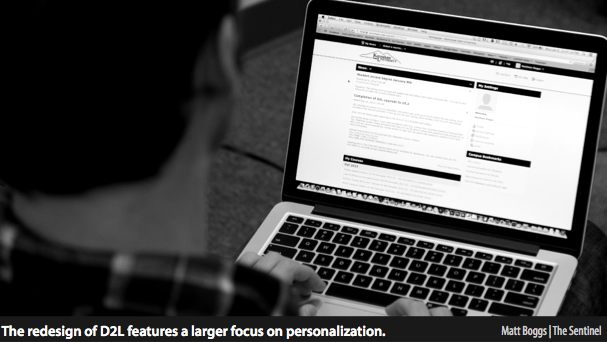
Kennesaw State University’s Desire 2 Learn class management system has seen a significant visual upgrade for the start of the Spring 2014 semester. After a period of downtime over the holiday break, the system is back online with a notable facelift. Though much of the program’s core functions remain the same, getting around the site will feel different for returning students.
This time around, D2L has put a larger focus on making the site more personal to each individual user. The profile editing page is much sleeker with the ability to link varying social networking accounts such as Facebook, Twitter and LinkedIn. As before, users have the ability to upload and use a profile picture from their computer, but the layout itself resembles a social network page much more after the update.
In an attempt to streamline the communication features of the system, D2L has added a toolbar at the top of the screen. This allows for quick access to courses, messages, updates and a user’s personal profile. The toolbar will also notify users when they have updates to any of the aforementioned utilities. Without having to navigate to a new page, users can get a quick view of all their important class discussions. While the email page remains largely the same, it is worth noting that its layout has been updated so as to fix the common issue of not being able to see the entire content of a message.
The profile progress summary page is a great way to keep tabs on oneself throughout the semester. It consolidates everything from discussions, quizzes, grades and content, all the way down to D2L login history and time spent on the site.
As this is a new feature, it will not include past progress. Once the semester begins however, this page will update quickly and provide an excellent way to track overall progress without having to go into individual courses. The “My Courses” section at the bottom of the main page is unchanged, but the layout of individual course home pages has been simplified. Before, users had to navigate to a separate page within the course in order to view content. Now, course content has been placed right on the course’s home screen, alongside news and updates. As with every other page in this updated D2L, the content is located in the center of the screen, as opposed to being on the left like before. This is a minor change that actually makes the entire experience feel more fine-tuned and usable.
The introduction of the Desire 2 Learn system one year ago caused a bit of a stir among teachers and students who had grown accustomed to the Georgia View Vista program. Upon D2L’s introduction, it was apparent that the programmers had a more user-oriented system in mind for KSU’s course management webpage. Now with the update to 10.2, that vision is starting to come together.


